Put related things close together, and users will understand your interface faster. That is the Law of Proximity in one clean bite. If a label sits near a form field, the brain says, “These two are teammates.” If a button floats far away, the brain says, “Why are you like this?”
TLDR: The Law of Proximity says that items placed near each other feel connected. In UX, this helps users read forms, menus, cards, and checkout screens with less effort. For example, moving error messages directly under form fields can cut correction time by 20% to 40% in many usability tests. If a shopper sees “Apply coupon” right beside the coupon box, they are less likely to abandon the task.
What is the Law of Proximity?
The Law of Proximity comes from Gestalt psychology. Gestalt is a fancy word for a simple idea. People see patterns before they see tiny details.
Your brain loves shortcuts. It groups dots, buttons, labels, cards, and icons by distance. Close items feel related. Far items feel separate.
That is it. No magic. No secret design club handshake.
Look at a login form. The email label should sit near the email field. The password label should sit near the password field. The “Log in” button should sit near the form, not hanging out in a lonely corner like it missed the bus.

Why proximity matters in UX
Users do not study screens. They scan. Fast.
They look for clues. Spacing is one of the biggest clues. Good spacing says, “These parts belong together.” Bad spacing says, “Good luck guessing.”
It drives me crazy when a form label is closer to the field above it than the field below it. That tiny mistake can add seconds of doubt. On a banking form, those seconds feel like pain.
Proximity helps with:
- Speed: Users find related actions faster.
- Clarity: Screens feel easier to read.
- Trust: Clean grouping feels more professional.
- Fewer errors: Users pick the right field, button, or option.
- Lower stress: The interface feels less noisy.
Gestalt Principles vs Laws of UX
This can sound confusing. It is not.
Gestalt principles come from psychology. They explain how people see and group visual information. Proximity is one of them. So are similarity, continuity, closure, and common region.
Laws of UX are design-friendly rules based on psychology and behavior. They help designers build better interfaces. They include ideas like Hick’s Law, Fitts’s Law, Jakob’s Law, and the Law of Proximity.
So what is the difference?
- Gestalt principles explain perception. They tell us how the brain groups what it sees.
- Laws of UX guide design choices. They tell us how to make screens easier to use.
Think of Gestalt as the science teacher. Think of Laws of UX as the friendly coach with a clipboard.
How proximity works on real screens
Let’s use a simple product card.
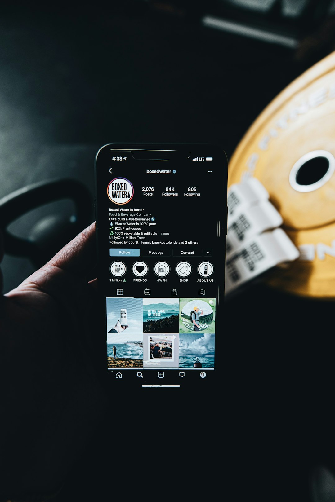
A product image, product name, price, rating, and “Add to cart” button should feel like one group. Put them close enough. Add space between separate product cards. Now the user sees each card as its own little shopping island.
If the spacing is messy, users may connect the wrong price to the wrong product. That is a fast way to create support tickets. Nobody wants to explain why socks cost $499.
Proximity in forms
Forms are where proximity either shines or starts a small fire.
A form should feel like a clean conversation. Ask one thing. Give one place to answer. Put help text near the field. Put errors near the exact mistake.
Bad example:
- The error message appears at the top of the page.
- The incorrect field sits far below.
- The user has to hunt for the problem.
Good example:
- The error message appears right under the field.
- The field border changes color.
- The fix is obvious.
A simple fix like this can save a lot of time. If 10,000 users fill out a signup form each month, and 15% hit an error, that is 1,500 people dealing with friction. If better proximity saves each person 8 seconds, that is over 3 hours of user time saved every month. From one spacing choice. Nice.
Proximity in menus and navigation bars
Menus also depend on spacing. Items in the same category should sit close. Different categories need breathing room.
A food delivery app may group “Pizza,” “Burgers,” and “Sushi” together under food types. “Orders,” “Wallet,” and “Support” should live in another group. If everything is packed into one long row, the user has to think harder.
Honestly, it feels like some menus were built by someone trying to win a tiny text contest. Small gaps. Similar labels. No groups. Expect to waste time tapping the wrong thing.
Proximity is not just about being close
This is where designers sometimes trip.
Close does not always mean better. Related items need to be close. Unrelated items need space.
If everything is close together, nothing feels grouped. The screen turns into soup.
Use proximity with contrast, alignment, and hierarchy. A good layout has layers. Some items are tight friends. Some are polite strangers.
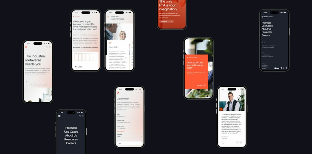
For example, a pricing page may show three plans. Each plan needs strong internal grouping. Plan name, price, features, and button stay together. But each plan must also have enough space from the next plan. That prevents visual confusion.
Gestalt rules that work with proximity
Proximity is powerful. It gets even better with other Gestalt ideas.
- Similarity: Items that look alike feel related. Same color buttons feel like the same type of action.
- Common region: Items inside the same box feel grouped. Cards use this all the time.
- Continuity: The eye follows lines and paths. Good alignment helps users move across a screen.
- Closure: The brain fills gaps. Icons often use this trick.
These principles work together. A card layout uses proximity, common region, similarity, and alignment at once. The user does not notice the theory. They just feel that the screen makes sense.
Quick UX rules for better proximity
Use these simple checks before shipping a screen.
- Group related items. Labels, inputs, hints, and errors should sit near each other.
- Add space between groups. Sections need clear breaks.
- Do not rely only on lines. Spacing often works better than borders.
- Keep buttons near their task. A “Save” button should not feel lost.
- Test on mobile. Tight desktop spacing can feel cramped on a phone.
- Watch real users. If they pause, hover, or misclick, spacing may be the reason.
A tiny user case
Imagine a SaaS settings page. Users need to change their notification email. The old design places the “Save changes” button at the bottom of a long page. Users edit the email field, scroll, then wonder if the button applies to the whole page or just one section.
The team moves the button closer to the email section. They also adds more space before the next settings group. In a test with 40 users, task completion rises from 72% to 90%. Average completion time drops from 46 seconds to 31 seconds.
No new feature. No giant redesign. Just smarter grouping.
Common mistakes to avoid
- Floating buttons: If a button controls a section, keep it tied to that section.
- Equal spacing everywhere: Equal gaps can hide relationships. Use larger gaps between groups.
- Labels too far from fields: This causes doubt, especially in long forms.
- Too many dividers: Lines can add clutter. Try space first.
- Crowded mobile UI: Fingers need room. Eyes do too.
The simple way to remember it
Proximity answers one question: “What belongs with what?”
If the answer is clear, your interface feels easy. If the answer is fuzzy, users slow down. They may still finish the task, but they will enjoy it less. And yes, they will blame the product.
The Law of Proximity is both a Gestalt principle and a useful UX rule. Gestalt explains why it works. UX practice shows where to use it. Put related things close. Give unrelated things space. Your users will not praise your spacing out loud, but they will move faster. That is the quiet win good design lives for.