Build your SaaS landing page around one clear promise, one clear audience, and one clear action. Speed matters too: pages that load in 1 second can convert much better than slower pages, with Portent reporting that a 1-second load time can produce conversion rates up to 3 times higher than a 5-second load time [source: Portent]. That means your landing page cannot just look nice. It has to answer doubts fast, rank for the right search terms, and make the next step feel obvious.
TLDR: A high-converting SaaS landing page needs a sharp headline, clear product value, proof, fast loading, and SEO content aimed at buyer intent. For example, if 10,000 people visit your page each month and your conversion rate rises from 2% to 3%, that is 100 extra trials or demos without buying more traffic. Use one main call to action, such as “Start free trial”, and repeat it after major sections. Cut anything that makes the visitor think too hard.
Start with the real customer problem
Most SaaS landing pages fail because they talk too much about features. Visitors do not wake up wanting “workflow automation.” They want fewer missed tasks, faster approvals, cleaner reports, or less manual work.
Your hero section should answer three questions in under five seconds:
- Who is this for? Name the audience clearly.
- What problem does it solve? Use plain language.
- What should I do next? Show one strong call to action.
A good headline might be: “Track client projects without chasing updates in Slack.” That is clearer than “The complete productivity platform for modern teams.” Honestly, vague SaaS copy feels like it was written to impress the company, not help the buyer.
Image not found in postmetaMatch SEO keywords to buying intent
SEO-friendly content does not mean stuffing keywords into every line. It means matching the page to what your best customers are already searching for.
Use keywords that show intent, such as:
- “best CRM for consultants”
- “project management software for agencies”
- “automated invoicing SaaS”
- “customer support tool for startups”
Place your main keyword in the page title, H1, first paragraph, meta description, and one or two subheadings. Keep it natural. If the page sounds strange when read out loud, rewrite it.
It drives me crazy when SaaS pages hide useful content behind fluffy slogans. Search visitors need answers. Add short sections for use cases, feature benefits, integrations, pricing hints, security, and FAQs. These help Google understand the page. They also help buyers trust you.
Use a conversion-focused page structure
Your landing page should feel like a guided path. Do not make visitors hunt.
- Hero: Clear promise, short supporting text, primary CTA.
- Problem: Show you understand the pain.
- Solution: Explain how your SaaS fixes it.
- Proof: Add testimonials, logos, reviews, or numbers.
- Features: Focus on outcomes, not tool menus.
- Use cases: Show how different customers benefit.
- Pricing or plan cue: Reduce doubt about cost.
- FAQ: Handle objections before they block signups.
- Final CTA: Repeat the main action.
Each section should earn its place. If it does not reduce doubt or increase desire, cut it.
Turn features into benefits
Features tell visitors what the product does. Benefits tell them why they should care.
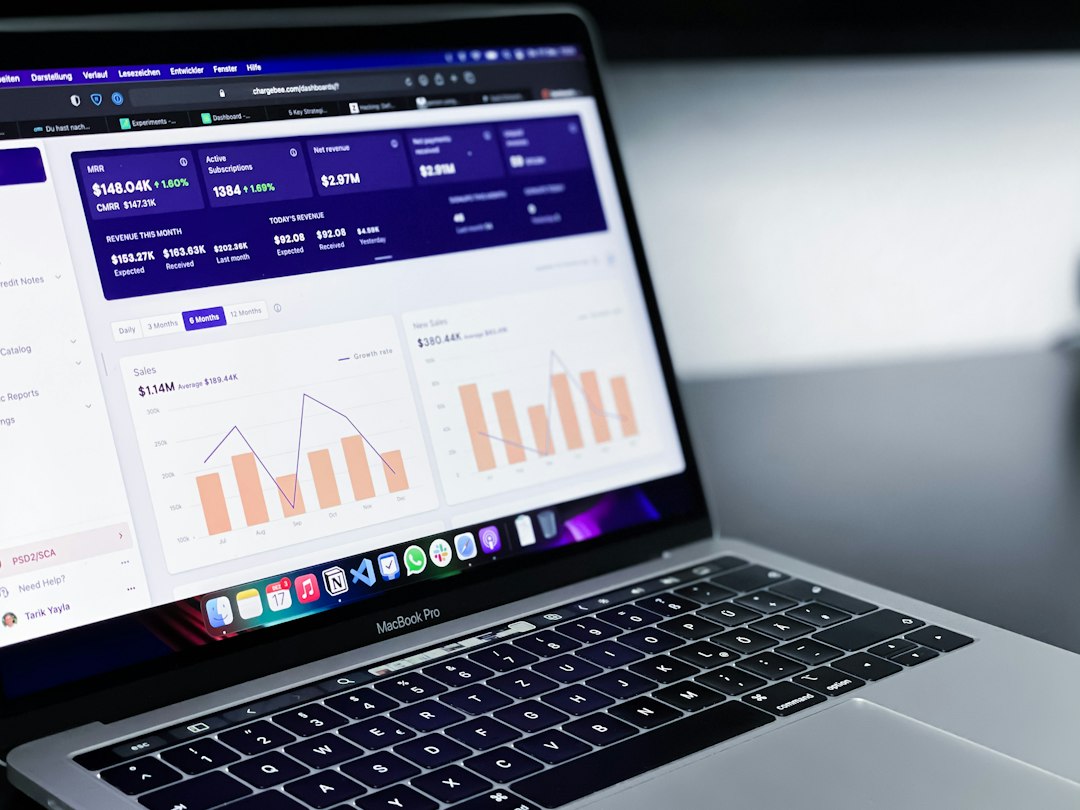
Instead of saying “Custom reporting dashboard,” say “See revenue, churn, and user activity in one dashboard without exporting CSV files.”
Instead of “Team permissions,” say “Give managers access without exposing billing or admin settings.”
This small shift can change the whole page. People buy the result. The feature is just the path.
Add proof near every major claim
If you say your tool saves time, show how much. If you say teams grow faster with it, show a customer story. Proof can be simple:
- “Saved 8 hours per week per manager.”
- “Reduced onboarding time by 34%.”
- “Used by 1,200 finance teams.”
- “Rated 4.8 out of 5 by verified users.”
Do not wait until the bottom to add trust. Put a short testimonial under the hero. Add customer logos near your first CTA. Place security badges near forms. Buyers need small trust signals throughout the page.
Make the CTA obvious and low friction
Your call to action should be clear, specific, and repeated. Good CTA text includes:
- Start free trial
- Book a demo
- See pricing
- Create free account
Do not use five different CTAs unless you enjoy confusing people. Pick one primary action. Use a secondary option only when needed, such as “Watch 2-minute demo.”
Forms should be short. Ask for the least amount of information possible. Every extra field adds friction. If sales needs more details, collect them after the first conversion.
Optimize for speed, mobile, and clarity
A slow SaaS page kills signups quietly. Compress images. Remove unused scripts. Avoid heavy animations. Use clean code and strong hosting.
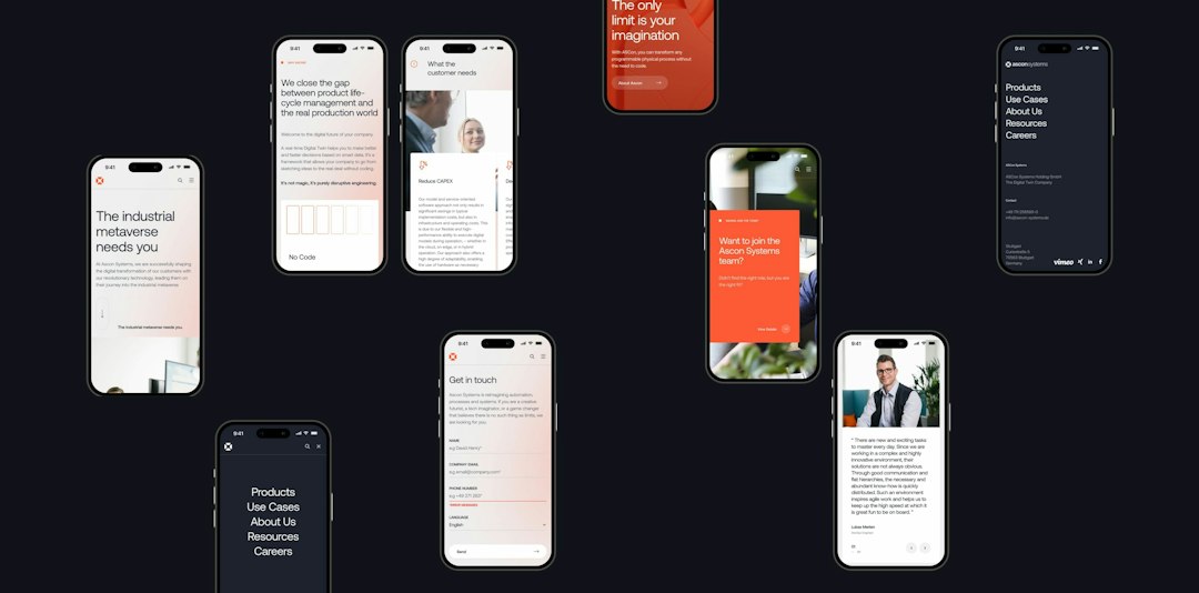
Mobile matters too. Make buttons easy to tap. Keep forms simple. Test your page on a real phone, not just a desktop preview. Expect to waste time on small layout bugs if you skip this. A button that looks fine on desktop can sit halfway off-screen on mobile.
Use FAQs to win search traffic and remove doubt
FAQ sections are useful for both SEO and conversions. They answer the questions people type into Google and the objections they ask before paying.
Good SaaS FAQ topics include:
- How long does setup take?
- Is there a free trial?
- What integrations are included?
- Can I cancel anytime?
- Is customer data secure?
- Do you support team accounts?
Keep answers short. Link to deeper pages if needed. The landing page should sell the next step, not become a product manual.
Test one thing at a time
Conversion optimization is not guessing. Test headlines, CTA text, proof placement, form length, pricing visibility, and demo offers. Change one main thing at a time so you know what worked.
Track the right numbers:
- Visit to signup rate
- CTA click rate
- Form completion rate
- Bounce rate
- Trial to paid conversion
A SaaS landing page that converts is not built from tricks. It is built from clarity. Say who you help, show the value fast, prove your claims, and make the next step easy. Do that well, and both search engines and customers have a better reason to choose you.